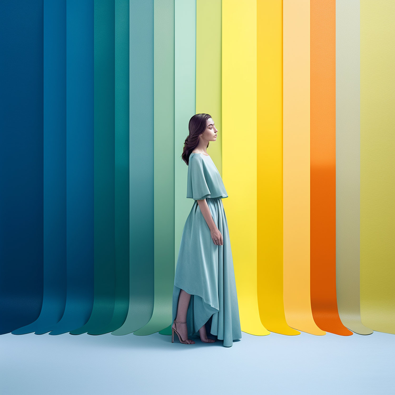
In the world of design, the Pantone Colour of the Year announcement is a highly anticipated event. Since 2000, the Pantone Colour Institute has selected a colour that they believe will be a leading trend in the upcoming year, influencing design across various industries, including fashion, interior design, and branding. 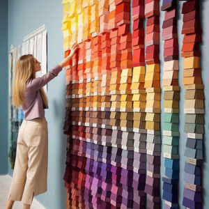 But what is the significance of this choice, and why does it matter? In this article, we’ll explore the history and impact of Pantone’s Colour of the Year.
A Brief History of Pantone
Pantone was founded in 1962 by Lawrence Herbert, who set out to create a standardised colour matching system for the printing industry. The Pantone Matching System (PMS) quickly became the gold standard, making it easier for designers and printers to communicate and reproduce accurate colours. Over the years, Pantone has expanded its influence beyond the printing world, becoming a global authority on colour trends and forecasting.
The Selection Process
Each year, Pantone’s colour experts comb the globe to observe and analyse emerging colour trends. They draw inspiration from various sources, including fashion, art, socio-economic conditions, and even political events. This exhaustive research culminates in a secretive meeting where the Pantone Colour Institute selects the colour they believe will define the upcoming year.
The Significance of the Colour of the Year
- A Reflection of the Zeitgeist: Pantone’s Colour of the Year serves as a snapshot of the prevailing mood and spirit of the times. It often reflects the social, political, and cultural atmosphere of the world, capturing the emotions and aspirations of the global community.
- A Design Trendsetter: The Colour of the Year has a significant impact on design trends across various industries. Fashion designers, interior decorators, and graphic artists look to Pantone’s selection for inspiration, incorporating the chosen hue into their designs. This makes the Colour of the Year a driving force in shaping the aesthetic landscape of the world.
- A Marketing Tool: Pantone’s announcement generates buzz and excitement, giving designers and brands an opportunity to capitalise on the trend. Companies often release products featuring the Colour of the Year, creating a sense of novelty and exclusivity around their offerings.
- A Cultural Conversation Starter: The selection of the Colour of the Year sparks discussions around the significance and symbolism of the chosen hue. It encourages people to think more deeply about the role of colour in our lives and its impact on our emotions, perceptions, and behaviours.
Pantone Colour of the year 2000 – 2022, the full list!
2000: Cerulean Blue
(Pantone 15-4020) – Cerulean Blue signifies the beginning of the new millennium with a calming, serene colour that encourages relaxation and contemplation. Its association with the sky reflects an optimistic outlook and the infinite possibilities of the future.
2001: Fuchsia Rose
(Pantone 17-2031) – Fuchsia Rose is a vibrant, bold pink colour that represents the energy and excitement of the early 2000s. The colour embodies the spirit of a new generation, with its daring and playful nature.
2002: True Red
(Pantone 19-1664) – True Red is a deep, passionate red that symbolises love, power, and strength. This color represents the determination and resilience that were prevalent in the post-9/11 era.
2003: Aqua Sky
(Pantone 14-4811) – Aqua Sky is a refreshing, calming blue-green hue that represents the desire for tranquility and balance in a fast-paced world. It evokes the beauty and serenity of water, nature, and the sky.
2004: Tigerlily
(Pantone 17-1456) – Tigerlily is a warm, exotic orange colour that reflects the adventurous spirit and growing global awareness of the time. It captures the excitement of exploring new cultures and experiences.
2005: Blue Turquoise
(Pantone 15-5217) – Blue Turquoise is a calming, cool shade of blue-green that conveys a sense of tranquility and escape. The colour reflects a desire for emotional balance and well-being in an increasingly hectic world.
2006: Sand Dollar
(Pantone 13-1106) – Sand Dollar is a neutral, versatile beige tone that reflects the increasing importance of sustainability and a connection to nature. It represents the growing interest in eco-friendly living and simplicity.
2007: Chili Pepper
(Pantone 19-1557) – Chili Pepper is a bold, spicy red hue that signifies strength, confidence, and excitement. This colour captures the daring, energetic spirit of the time, symbolising the desire for adventure and passion.
2008: Blue Iris
(Pantone 18-3943) – Blue Iris is a harmonious blend of blue and purple, representing creativity, inspiration, and imagination. It encourages introspection and self-expression, embodying the artistic and innovative spirit of the era.
2009: Mimosa
(Pantone 14-0848) – Mimosa is a warm, optimistic yellow that signifies hope and positivity during the global financial crisis. It embodies the resilience and uplifting spirit needed to navigate through challenging times.
2010: Turquoise
(Pantone 15-5519) – Turquoise is a vibrant blue-green colour that represents the desire for escape, relaxation, and serenity. It evokes the beauty of tropical waters and the rejuvenating power of nature.
2011: Honeysuckle
(Pantone 18-2120) – Honeysuckle is a dynamic, uplifting shade of pink that reflects the optimism and energy of the early 2010s. It embodies the spirit of renewal and growth, inspiring courage and confidence.
2012: Tangerine Tango
(Pantone 17-1463) – Tangerine Tango is a lively, energetic orange-red hue that represents the desire for excitement, fun, and adventure. It captures the vivacity and enthusiasm of the era, encouraging bold self-expression.
2013: Emerald
(Pantone 17-5641) – Emerald is a lush, elegant green that symbolizes growth, renewal, and prosperity. It reflects the trend towards environmental awareness and the importance of reconnecting with nature.
2014: Radiant Orchid
(Pantone 18-3224) – Radiant Orchid is a captivating blend of purple, pink, and fuchsia that inspires creativity and innovation. The colour represents the fusion of technology and art, expressing the desire for originality and individuality.
2015: Marsala
(Pantone 18-1438) – Marsala is a rich, earthy red-brown hue that exudes warmth and sophistication. The colour embodies the growing interest in natural elements, rootedness, and the appreciation of the finer things in life.
2016: Rose Quartz & Serenity
(Pantone 13-1520 & 15-3919) – Rose Quartz and Serenity are a harmonious pairing of soft pink and tranquil blue that reflects the cultural shift towards gender equality and fluidity. The colours represent balance, calmness, and a sense of unity in a rapidly changing world.
2017: Greenery
(Pantone 15-0343) – Greenery is a fresh, revitalising shade of green that symbolises new beginnings and the importance of nature in our lives. It represents a renewed focus on the environment and the desire for growth and personal development.
2018: Ultra Violet
(Pantone 18-3838) – Ultra Violet is a bold, mystical shade of purple that embodies creativity, spirituality, and the mysteries of the cosmos. The colour represents the exploration of new frontiers, both physical and mental, and the desire for self-discovery.
2019: Living Coral
(Pantone 16-1546) – Living Coral is a vibrant, life-affirming hue that reflects the beauty and fragility of our oceans and coral reefs. The colour symbolises the need for optimism, warmth, and the importance of preserving our natural world.
2020: Classic Blue
(Pantone 19-4052) – Classic Blue is a timeless, calming shade of blue that represents stability, reliability, and a sense of security. The colour evokes the night sky and deep waters, providing a sense of calm and clarity amid uncertain times.
2021: Illuminating & Ultimate Gray
(Pantone 13-0647 & 17-5104) – Illuminating and Ultimate Gray are a contrasting yet complementary pair of colours, representing hope and resilience during the COVID-19 pandemic. Illuminating is a bright, optimistic yellow that signifies positivity, while Ultimate Gray conveys a sense of stability and dependability.
2022: Very Peri
(Pantone 17-3938) – Very Peri is a lively, periwinkle blue hue with violet-red undertones that embodies the fusion of technology and creativity. The colour represents the innovative spirit and adaptability of the era, encouraging bold self-expression and embracing the digital world.
Notable Colour of the Year Selections
Some memorable Pantone Colour of the Year choices include:
- 2020: Classic Blue (PANTONE 19-4052): A timeless and enduring hue, Classic Blue was chosen to symbolise stability and calmness during a time of global uncertainty and rapid change.
- 2016: Rose Quartz (PANTONE 13-1520) & Serenity (PANTONE 15-3919): For the first time in history, Pantone selected two colours to represent the year. These soft, pastel hues reflected a growing societal need for harmony and balance.
The Pantone Colour of the Year is more than just a hue; it’s a powerful symbol of the times we live in, reflecting our collective aspirations, desires, and emotions. By capturing the essence of the global zeitgeist, Pantone’s annual selection influences design trends and ignites cultural conversations, reminding us of the vital role colour plays in shaping our world. Keep an eye out for the next Colour of the Year, and embrace the opportunity to engage with the ever-evolving tapestry of colours that define our lives.